CLICK HERE to view the full report which includes species specific data.
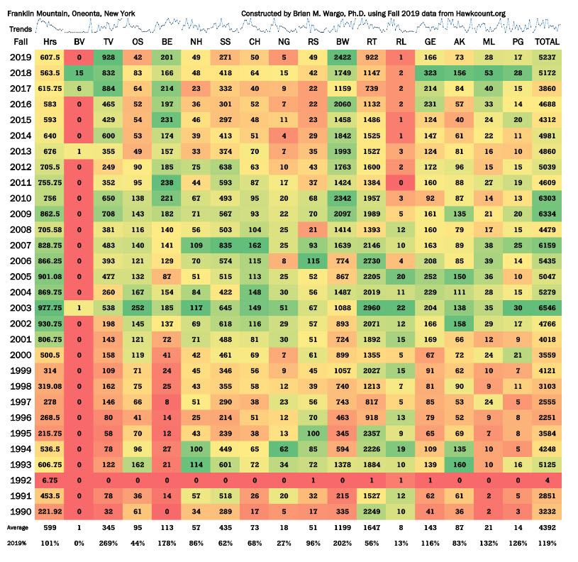
To read the table at the top portion of the page, a green to red gradient allows for a quick view of the highest count year (dark green) to the lowest (dark red).
At the bottom of the table, there are summary statistics that show the average values for each species over the years. This is followed by how this year compares to an average year.
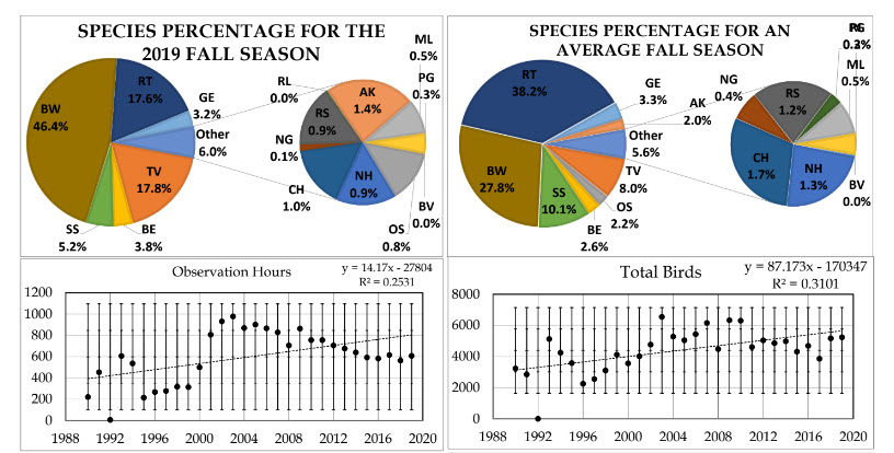
The pie charts located below the table shows the composition of the most common hawks for both the Fall of 2019 and then for the twenty-year average.
All of the scatter plots following the pie charts have five fine dashed lines:
- The middle-dashed line shows the mean or average value.
- The dashed line above and below the mean line represents one standard deviation, while the outside dashed lines represent an additional standard deviation. One standard deviation represents 68% of the data in a normally distributed system, while two standard deviations represents 95%.
- The R2 value is the correlation coefficient and marks the goodness of fit for a linear function. An R2 value of 1.0000 indicates a perfect fit of your data to a line, whereas an R2 value of 0.0000 shows that the data points are seemingly random and have no linear fit.
